Keeping with the definition that a metric is used to tell a story, let’s look at an influential metric and how it was established, as well as a few things about how it has been historically presented. I’m going to use the metric as a way of red-flagging a few “don’ts” in presenting metrics, as well: if a metric tells a story, the story may also be exaggerated deliberately or by accident. But, when it’s an important metric that’s being manipulated, which do you think is more likely: accident or deliberate spin?
The Poverty Line metric is widely used as an indicator of the economic well-being of a country’s population. The assumption is that if there are more people living below the poverty line than before, the economy is getting worse, or that economic unfairness is affecting the people on the margins of the poverty line, or something like that. If you start thinking about it, it’s not so simple!
 |
| Charles Booth 1840-1915, producer of social sciences metrics, including the first Poverty Line |
Attempting to establish a clear cause/effect relationship might be difficult, unless the metric is presented with some additional data that correlates with the change. This is where things get complicated, and fortunately for us in computer security, we are generally dealing with smaller, neater, problems and don’t have populations of millions to deal with.
Before we go any further, keep in the back of your mind the idea that we’re not sure what all the factors affecting a Poverty Line might be, to say nothing of how the Poverty Line metric is calculated.
Charles Booth was an influential social reformer with a deep interest in poverty. Among his key accomplishments was helping cause the creation of the British old age pension system, and free school meals for poor children. In the 1890s, Booth was strongly critical of the government’s census data and collection process, and then found himself embroiled in one of the hot social issues of the time: how many people were living in abject poverty in London. Politicians were throwing out a number around 25%, but more careful studies indicated that the number was closer to 35%.
In order to help establish a means test for the school board to determine which children would qualify for free lunch, Booth and his number cruncher Clara Collet calculated a Poverty Line at the amount necessary to feed a family of 4-5 people. How did he come up with that? You go to the store and see what it costs to produce an inexpensive meal, and multiply.
Every metric must start somewhere.
If you’re like me, you’re furrowing your brow at that and thinking, “that seems a bit haphazard” but there are a few things worth looking at more closely: first off, by basing it on the cost of food, which tends to be pretty constant between regions, he was able to get away from the bigger problem of separating what people think they need from what Booth thought they needed. The metric came out of the gate already normalized (with slight local fluctuations) and it allowed Booth to not have to tackle the much more complicated problem of “what is Poverty?” but instead to focus on who had 10-20 shillings per month to spend on food.
There’s a lesson in here for us security people who want to establish metrics: Sometimes it’s hard to define what you’re measuring and you use an abstract metric to become part of the definition of what you’re measuring.
Prior to Booth, “abject poverty” probably meant different things to different people (can’t afford food, versus can’t afford clothes, or a place to live) but then “abject poverty” means “below the poverty line” – which is a recursive definition, really. When you’re establishing metrics I suppose you can consider your efforts successful if you wind up stuck in that particular trap.
Poverty has always been an issue of interest to both sides of the political spectrum, and it was especially interesting to the US after the Great Depression. You have a great deal of popular discontent, and a great deal of debate and effort from government regarding what to do about it, and a metric that indicates gross changes in population well-being would be a pretty useful thing to have if you are wondering whether things are getting better or worse.
Mollie Orshansky established the US Poverty Line based on two low-cost food plans from the U.S. Department of Agriculture. Basically, the USDA food plans were intended to provide a certain number of calories per day in a variety of ways, so Orshansky’s Poverty Line was pretty straightforward: if you can’t afford to buy the minimum food requirement, you’re poor.
By now you may be furrowing your brow and muttering “but that’s an extrapolation based on an estimate of an approximation!” and you’re right if you are. But – it works, if you’re using it correctly. Remember: that’s not really intended to be a definition of what “Poverty” is but it’s intended to allow us to track changes in what the metric shows. It’s also a great illustration of something that you almost certainly will do when you set up your security metrics: you’ll calculate things based on each other without rigorously defining things all the way down. Because, it turns out, it’s not necessary.
Let me re-cast that explanation in terms of computer security: suppose you’re doing vulnerability management and you’re tracking your performance over time. You have decided to keep a metric of the number of “critical” and “high” severity vulnerabilities in your network over time because you think “more vulnerabilities is bad” therefore watching the vulnerability rate go up and down is an indicator of improvement or worsening badness in your underlying network. But if you want to define your items all the way down, what is a “critical” vulnerability? Where does that come from? Well, when a new vulnerability is found, it gets scored against a heuristic and is assessed as “critical” or “high” or whatever.
Sure, if you’re completely crazy you could reassess every single vulnerability and decide whether your vulnerability scanner scored it correctly – or you can just construct new abstractions on top of older abstractions, and keep going. You’ll encounter this again and again as you get into metrics – it’s a bit hard to wrap your brain around the idea, but it’s OK to extrapolate on top of an extrapolation as long as the underlying extrapolation doesn’t change. If it doesn’t change, the data is going to be self-normalizing – the abstraction sort of cancels itself out. In fact, metrics built on top of more metrics will sort of adjust themselves if the underlying metric changes.
Consider Orashansky’s Poverty Line based on USDA’s food cost for calories: what if USDA adds 200 calories? The cost of the food goes up, which means that more people suddenly fall below the poverty line. How do you handle this? You back-compute the old chart using the new abstraction, or you put a note on the new chart showing the inflection point where your assumptions changed.
That’s how to be intellectually honest with metrics; that’s how to produce metrics that are useful and don’t manipulate the viewer’s perception.

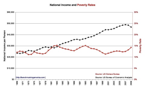
The US Poverty line since 1969, showing income in black. (Source)
The chart above shows the Poverty Line and income (wages) since 1969. I’m not even sure what message we are supposed to get from it, though it appears to be something like “poverty has remained relatively constant, though overall incomes have gone up”. But here’s the problem: the poverty line calculations didn’t start in 1969. They started in 1959. Why would anyone have arbitrarily decided to leave data off?

Well, there’s one answer for you: the decade from 1959 to 1969 shows a pretty impressive move in the poverty line, compared to which the variations since 1969 look fairly minor. And look how it dipped way down in 1974 and 1999! So, there was an agenda in the first version of the chart – what could that agenda be? I’ll leave it to you to speculate. The important point is: if you want your metrics to be intellectually honest: present all the data, all the time. If you need to zoom in on a particular region of time, produce another chart, or a zoom-region chart, that clearly shows the overall trends as well as the recent changes.
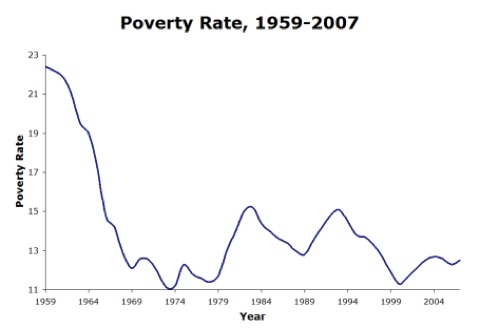
I’m not saying the previous chart is good, by the way! The first two charts I presented both lie, in different ways. Here’s another version:

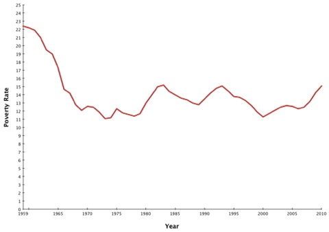
(Source)
By including the X-axis down to zero, it now looks like poverty rates have been fairly constant (the dip in 1976 is revealed to be insignificant) and we can see that there haven’t been large changes since the social programs that came after the Great Depression and WWII. I’m guessing at this point that you know what’s next: why is the top of the chart cut off?
All of those charts lie to some degree or another, and that’s the point that I wanted to make with them. By cutting data off on the left, the chart showed something completely different. By truncating at the bottom it showed something else, and by truncating at the top it showed another thing entirely. The first of those charts appears to be leading us away from the conclusion that either ending WWII was a good idea or the post-depression attempts to improve the poverty situation worked. The second really wants to show that attempts to improve the poverty situation have worked pretty well, all things considered, and the third wants to show that attempts to improve the poverty situation have been fairly insignificant since the end of WWII and the Depression.
Please, dear reader, do not do those things to your metrics.
Here is how to be honest with your metrics:
• Always show the full time-sequence of data that’s available to you
• Don’t truncate your X-axes
• Clearly mark on your charts if you switch extrapolations and that causes an inflection point
If you’re interested in how to manipulate statistics because you want to go over to The Dark Side, you should obtain and read a copy of Darrell Huff’s “How to Lie With Statistics” which is a witty, short, clear book that describes the popular ways that immoral hacks use to manipulate their readers. It has great illustrations and much math; I highly recommend it – if only because you won’t watch network news without wanting to scream on a regular basis.
Another thing you should always keep in your back pocket when you’re talking about any metric that you produce: have a little write-up handy about how you do it. In some cases, it may be very important to present that information first and then get to the metric (I’ll explain why, in a future piece) and it may also be useful if you get hit by a bus. But more than anything, it’ll educate or silence the occasional nitpicker who asks you, “Wait! How did you come up with that?” I’m not going to go through it here, but – for example – the US Census Bureau has an excellent, brief, clear write-up on “how do we calculate the Poverty Line” It’s worth a look!
The crucial points I want you to come away with from this section are that:
• It’s OK to pile extrapolations atop extrapolation as long as you do it consistently and honestly
• Using the same underlying extrapolations tends to self-normalize your data enough that you’re probably OK without reviewing your entire epistemology
• State your methodology
• If your numbers speak for themselves, and they should, there’s no need to lie with statistics
• If you catch someone lying with statistics, the technique that they used always reveals the bias they were trying to push onto you; it’s like wondering “which direction was that arrow shot from?” it gives itself away
• Your metrics do not need to be perfect (in fact, I’m not even sure what “perfect” would mean in that context) in order to be illustrative and valuable – stay focused on telling your story with your numbers and let the truth take care of itself.
Oh, one more thing: any time someone tells you “80% of security breaches are inside jobs” ask them how they established that metric. [1] It’s cheap entertainment at a conference.
Next up: How to establish your own metrics. Where do your goals come from? What to do and what not to do.
Notes and See Also:
[1] The process is called “numerological procotology”
• The development of the Orshansky Poverty Metric (US Census Bureau) – Unfortunately ignores Booth entirely, so it sort of sounds like poverty metrics were an American invention.
• Clara Collett and Charles Booth – I bet you’ll be shocked to know that the hard work on Booth’s poverty line was “women’s work” and Booth got most of the credit.


