

In the preceding episode we looked at some stock charts that illustrate change in value over time. A time/value series is the metric you will probably want to present most frequently, because what we’re doing in security is deeply connected to events in time. It has the wonderful property of leveraging your eye and brain in a way that makes it immediately comprehensible.
While there are other trend lines that can be added to the chart, you hardly need them – your brain will do a pretty good job of “smoothing” the trend line into a fitted curve, as well as interpolating values between measurement points as necessary. I guess it’s probably an application of the circuitry in our brain that evolved for estimating trajectories, which, if you’ve ever played Frisbee, is remarkably good at figuring out where things are going before they get there.
If you want to play with this, take a few charts on a stock-picking site that lets you turn on various moving averages, then make a couple of estimates on your own as to where the trends are going, and turn on the moving averages. What you’ll notice is that the mathematical approaches (30-day moving average, weighted moving average, average, etc.) tend to perform slightly differently from what your brain is telling you a mosquito would do if it was flying around on your screen. Either way, it really won’t make much difference: if you’re trying to present a metric for security, you’re generally illustrating “this is what happened” and allowing your reader’s mind to make its own extrapolation for what’s likely to happen next.
My recommendation is to keep it simple and let your reader’s visual system work its magic.
Try not to confuse your brain while it’s working to interpret your charts. One thing not to do is to present charts together that represent disconnected things, or that don’t vary together. If you’re presenting several things to demonstrate a connection between them, you should have the values on the same scale or you’re defeating the reader’s eye/brain gestalt. For example, let’s say that you want to present a chart of vulnerabilities over time, to illustrate the effect of varying operating systems on your overall vulnerability rate. You might start with the following values:
• My network’s vulnerabilities (high or critical)
• Windows XP vulnerabilities (total high and critical in CVS)
• Linux (RHEL) vulnerabilities (ditto)
• Windows 7 vulnerabilities (ditto)
See the problem here? You’ve got some numbers that are probably related, but they’re almost certainly going to be on a different scale because in one case you’re measuring instances in someone else’s database and in another you’re measuring your experience. If you want to let the numbers track together (if they do) you should use all numbers from one source. In other words:
• My network’s vulnerabilities (high and critical)
• Windows XP vulnerabilities observed on my network (high and critical)
• Linux (RHEL) vulnerabilities observed on my network (ditto)
• Windows 7 vulnerabilities observed on my network (ditto)
This still isn’t perfect, because the first number is a summary of the last three, so it’s going to throw the X-axis of your chart higher and it may confuse your readers’ brains because the summary will always look “worse” than the source inputs.
The simple solution is “don’t do that!” Go back to our starting principles: your metric is trying to tell a story, and the story you’re telling is “vulnerability rates observed by operating system type over time.” In that case, why not present it as changes in percentages over time? The percentages will all add up to 100 and that will keep the X-axis scaled cleanly.
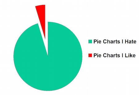
Now it’s time to talk about pie charts and how evil they are. Generally, when someone is complaining about pie charts, their objection is aesthetic; yes, pie charts are ugly and waste a great deal of space, but that’s not why to hate them. The problem with a pie chart is that it’s a snapshot of an instant in time and consequently, can be deceptive. With security data, you will almost never benefit from using a pie chart instead of a time/value chart, unless you only have a single instance of data. And you should only have a single instance of data when you first begin your metrics program, but you’re already past that point, right?

In the illustration above, you can see that my opinion of pie charts has changed over the years, in fact fairly dramatically. To get the same amount of information, I’d have to give you a string of pie charts. Yet each pie chart (I made the little miniature ones from the same data set) is a slice through the data set at any given time: it’s a snapshot of a moving number in time. That makes me less and less impressed with pie charts, because I can’t tell from the pie chart if the underlying numbers are fluctuating wildly or trending gently.
Whenever I see a pie chart, I briefly wonder if the person presenting it is trying to manipulate my perception of the data, or if he’s just not thinking very hard. I’m generally a suspicious person, so I start wondering how much the data values vary over time, and whether the snapshot represented by the pie chart was carefully chosen to lie to me.
Remember the riddle, “What is the best time to plant an oak tree?” The answer is “50 years ago.” That applies to metrics, too. The best time to have started your metrics program was about 2 years ago, so you’d have a nice run of numbers to work with and to compare against.
Lessons:
• Avoid pie charts; they’re not just ugly, they’re a waste of space.
• Think hard about how to present comparative metrics on a single chart; always try to design the chart so that things that vary together are on the same scale.
• Design your presentation so that your reader’s eye/brain gestalt works with you, not against you.
Next Up: More Dos and Don’ts